The paint on the walls of your commercial space is a powerful business tool. Your chosen colors directly influence client perception, employee mood, and purchasing behavior. Unlike residential painting, which focuses on personal comfort, choosing paint colors for a commercial environment requires a strategic approach rooted in psychology, branding, and practicality. Whether you run a retail store, a corporate office, or a medical clinic, understanding the impact of color is the first step toward creating a functional and successful space.
The Psychology Behind Choosing Paint Colors
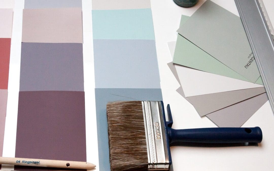
When deciding on paint colors, commercial property owners must consider the emotional response each shade evokes. Color psychology is paramount in commercial design. For instance, blue is often associated with trust, stability, and productivity, making it a popular choice for corporate offices and medical facilities. Green is linked to nature, health, and tranquility, working well in healthcare environments or creative offices to foster balance. Yellow evokes energy, optimism, and warmth, and it is excellent for grabbing attention in retail, but it must be used sparingly, as too much may cause anxiety. Red is highly stimulating, increasing appetite and attention, making it suitable for restaurants, but it should be avoided in quiet or stressful environments due to its intensity. By aligning your color choice with the core purpose of your business, you will subtly guide the experience of every person who walks through your doors.
Choosing Paint Colors That Speak to Your Business
Your color palette is a crucial component of your brand identity. The hues you select should reinforce your logo, your values, and the services you provide. If your company brand features a vibrant, modern aesthetic, incorporating those signature colors as accents reinforces brand recognition. A law firm seeking to convey tradition and stability might lean toward deep grays, rich blues, and classic creams. Consistency is also key, especially across multiple locations; maintaining the same brand colors in lobbies and public-facing spaces creates a professional and seamless client experience. When choosing paint colors, always think about your target demographic. A youthful tech startup might embrace bright, stimulating colors, while a high-end spa needs soft, muted tones to promote relaxation.
Practicality and Finish: Choosing Paint for Durability
Durability is non-negotiable. High-traffic areas like hallways, restrooms, and break rooms demand highly durable paint finishes, so opt for semi-gloss or high-gloss finishes in these areas for low maintenance. These finishes are easier to clean and resist scuffs better than flat or matte paints. While matte looks sophisticated in low-traffic areas like private offices, it is impractical for public zones. Lighting matters as well; the quality of light, natural or artificial, will drastically alter how a color appears. Always test large swatches on your walls and view them at different times of the day before committing, as this testing phase is critical when choosing paint colors for commercial use.
Creating Flow and Defining Spaces
A successful commercial painting strategy uses color to guide people and delineate function. Rather than painting every room the same, use color to strategically organize your space. In large office buildings, different floors or departments could be assigned subtle color variations to aid in navigation, making the environment intuitive and easy to follow. In retail, warmer, brighter colors draw attention to merchandise displays, while cooler colors could be used in fitting rooms to make the area feel calmer. For open-plan offices, a single accent wall painted in a productivity-boosting color will define a collaborative zone without needing physical dividers. When choosing paint colors, remember that color can serve as a non-verbal cue, signaling where employees should focus or where clients should wait, improving both efficiency and the client experience.
Frequently Asked Questions (FAQs)
How often should a commercial space be repainted?
The frequency depends on the space’s use and traffic. High-traffic retail, hospitality, or common areas (like lobbies and hallways) may require refreshing every three to five years. Lower-traffic corporate or private offices could typically wait seven to ten years.
Should I use the same color in every room of a large office?
It’s best to vary the colors subtly. Using a consistent neutral base color in most areas and then using complementary colors helps maintain brand unity while catering to the function and needs of each space.
Is it worth paying more for premium commercial-grade paint?
Yes, absolutely. Commercial-grade paints are formulated for superior durability, better washability, and greater resistance to fading and abrasion. The slight increase in initial material cost is quickly offset by the reduced frequency of repainting and the lower long-term maintenance costs.
St. James Commercial Property Inspections offers inspection services in North Carolina and Southern Virginia. Contact us to request an appointment.